THE CONTEXT

LGBT Youth Scotland is Scotland’s leading charity supporting LGBTQ+ young people ages 13-25.


As Marketing and Communications Officer from 2022 to 2026, design became central to almost everything I delivered — from brand strategy and guidelines through to merchandise, annual reports, print advertising, digital content and campaign creative.


This is where I learned what it means to build a brand from the inside out.

The Brief

When I arrived, the charity’s visual identity was a patchwork — a mix of early 2010s branding, inconsistent typography, stock imagery and a rainbow polygon gradient that had become a crutch rather than an asset.

At the same time, the charity was shifting its primary communications from Twitter to Instagram and LinkedIn — platforms where every post needed a compelling visual. Something had to change.

The Approach

The refresh wasn’t a rebrand from scratch — it was a careful evolution that respected what existed while giving the brand a coherent, modern foundation.

The rainbow polygon gradient wasn’t scrapped — it was honoured. Rather than removing it entirely, the gradient itself was reborn inside the charity’s logo, giving it new life in a more intentional form.


I pulled 5 of the original brand colours from the polygon gradient, refined their tones, and replaced the harsh red that had been used with a new sunset yellow.

LGBT Youth Scotland geometric logo
old logo-02

Typography was unified under the Helvetica family that was already appearing across some materials — making the decision feel consistent with the existing identity rather than imposed on it.

Two small icons from within the logo — known internally as “the wee icons” — were developed into a full visual language: used as icon sets, background textures and design elements that gave the brand a distinctive, ownable pattern system. Inspired by modern Memphis design, the overall direction brought boldness and structure to a brand that had previously lacked both.

The result was the charity’s first set of proper brand guidelines — a document that gave the whole organisation a shared language for how to show up.

BEYOND THE BRAND

With a consistent visual identity in place, content creation became faster, bolder and more effective. Across Instagram and LinkedIn, audience numbers grew by over 140% during my tenure — driven in part by the ability to produce compelling, on-brand content at pace.

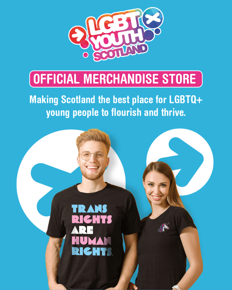
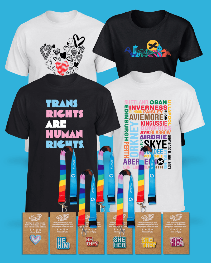
A merchandise range was designed and launched from scratch — including the charity’s first online store — generating over £7,000 in gross sales in its first year.

merchrangecover
merchrange

Do you need a merchandise range that actually sells?

The most successful product was a series of LGBTQ+ identity unicorns, originally designed for apparel and later reimagined as enamel pin badges.


These became some of the charity’s most loved products, and formed the centrepiece of an Adopt a Unicorn Christmas campaign — complete with a full suite of supporting materials including bookmarks, thank you cards and stickers, all designed in-house.

Other output over four years included annual reports, newspaper print advertising, digital campaign assets, website management across WordPress and Shopify, and day-to-day design support across every area of the organisation.

THE TAKEAWAY

This wasn’t a single project — it was four years of building something properly. If you’re a small organisation that needs someone who can think strategically, execute across every format and still sweat the details, this is what that looks like in practice.

Ready to push your brand to its fullest potential?